
This posting will be a continuation of the theme I posted about a few weeks ago regarding English-language logos seen so frequently on outerwear here in Russia on things like t-shirts, sweatshirts, coats, caps and the like. Some of these are obviously broken English and sometimes make little to no sense. They tend to be amusing though they can also evoke other emotions, as I will indicate below. Others, which can look at first glance like more natural English or which are modeled after American themes, on closer inspection are also nonsensical. I’ll include a few examples below.
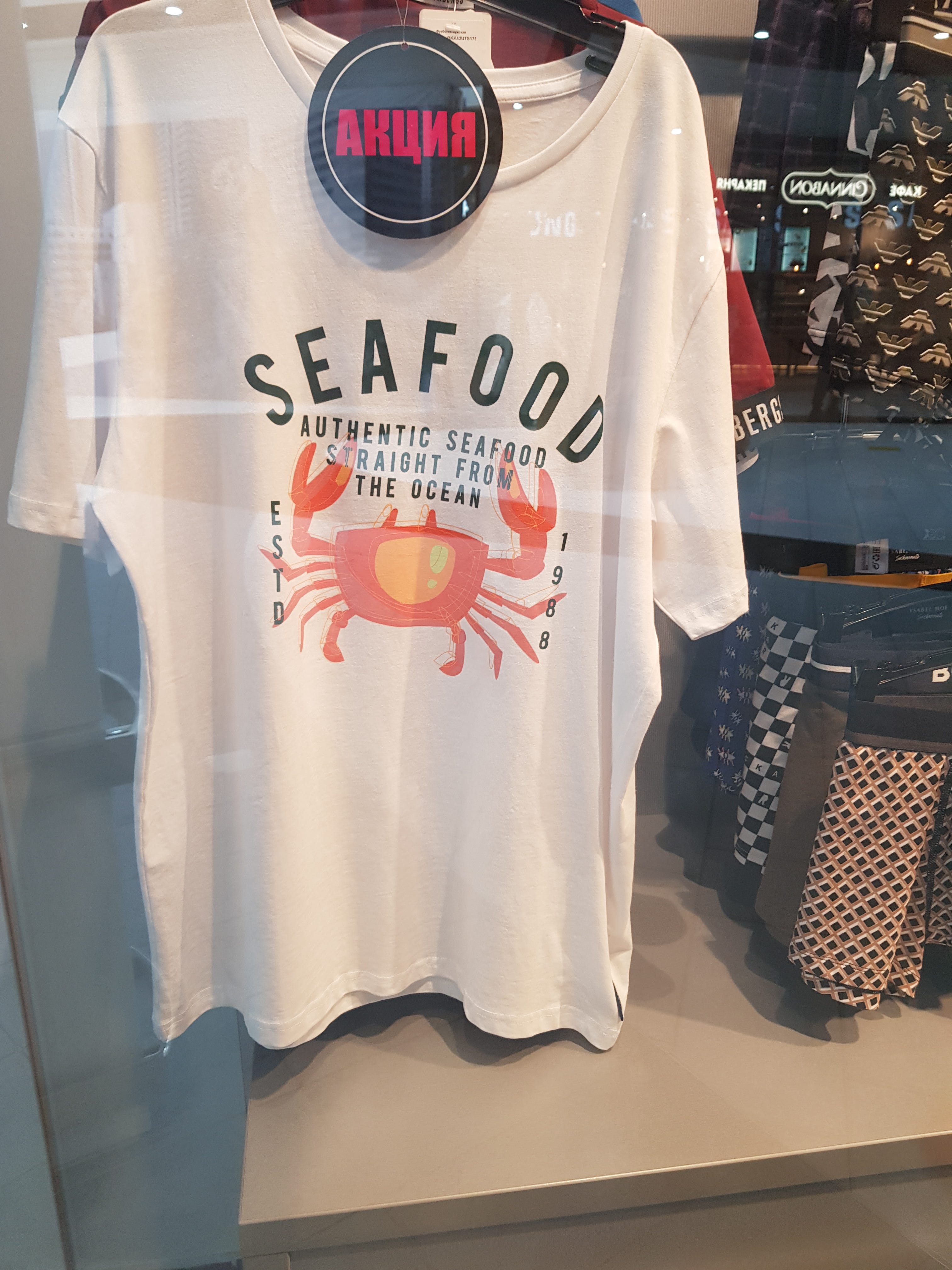
The above example seems clearly modeled on t-shirts and outerwear that are often sold in U.S. tourist destinations that advertise some business—often a bar or restaurant. But this one is clearly not promoting any particular restaurant, despite its proclamation of a founding year. One wonders if the creator even knows what the abbreviation ESTD stands for.
Taken literally the shirt seems to be indicating that people only began eating seafood—at least seafood straight from the sea—in 1988. Perhaps it only dawned on humanity that eating seafood immediately after it had been captured from the ocean is better than taking it inland and waiting some days or hours to consume it? And how fortunate that 1988 discovery was! Actually, on further reflection I was definitely eating seafood prior to 1988 and, if memory serves it was every bit as fresh—perhaps even more so—as seafood I’ve eaten since 1988. So it definitely looks like they got the discovery year wrong.
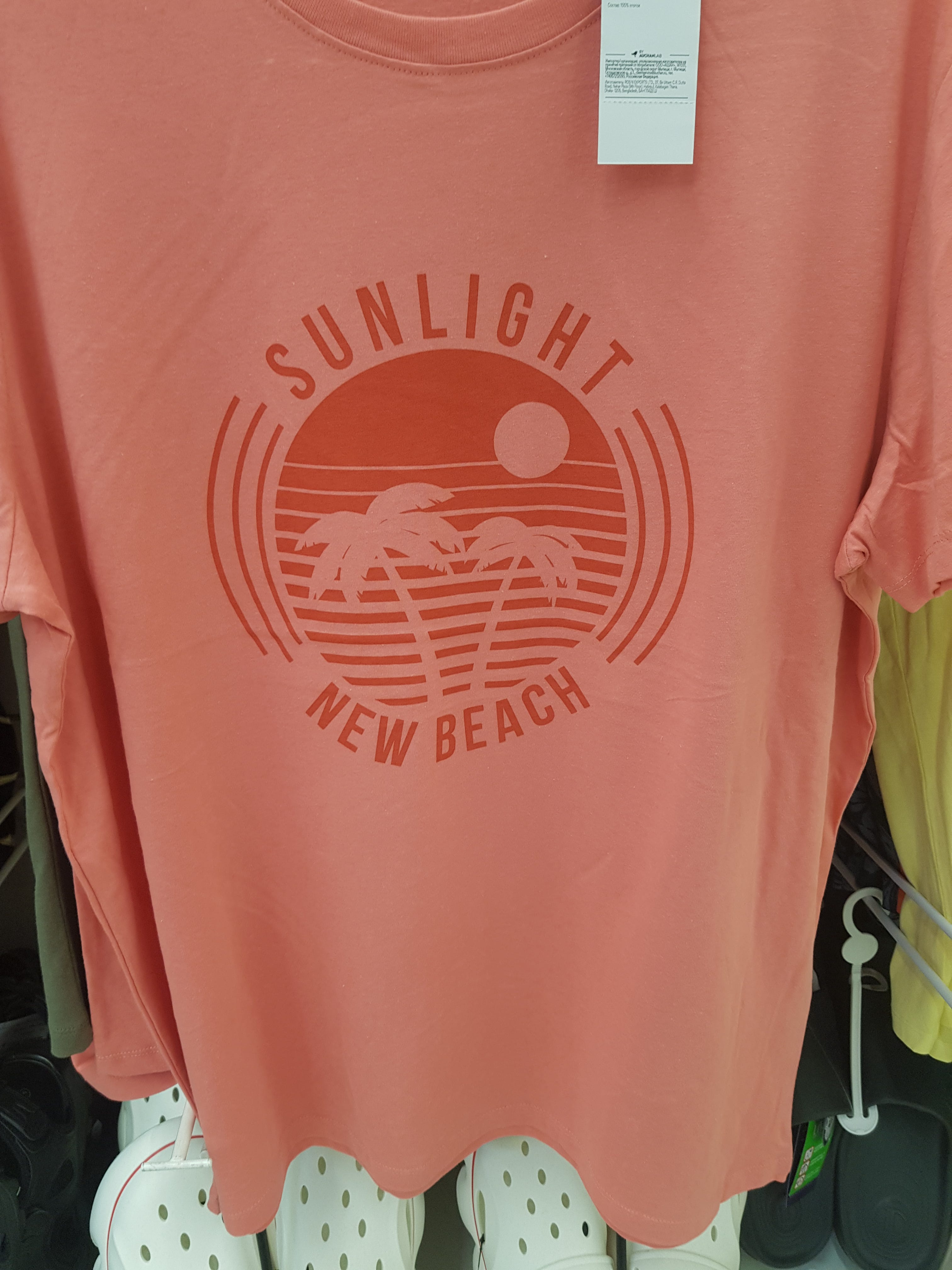
The one above is likewise wildly generic. Clearly modeled on t-shirts that advertise some beach or seaside resort, it seems rather, interpreted literally, to be celebrating any and all new beaches. Or perhaps renovated beaches? Or maybe even just ones with palm trees, ones that we happen to have visited for the first time and so that are new to us?
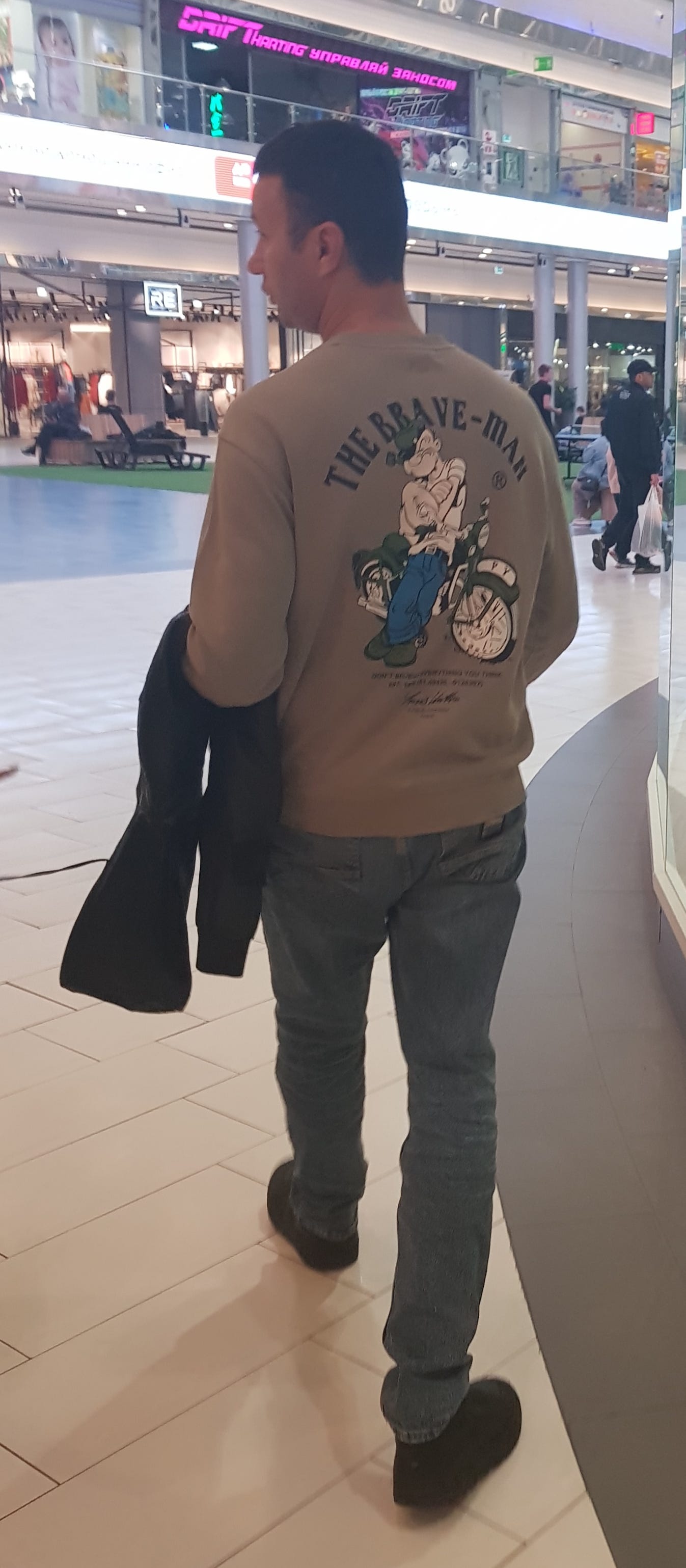
This one was seen worn by a fellow walking through the local mall. I didn’t get close enough to read the finer print below the graphic and was taking the photo on-the-fly, as it were, so I was trying not to be obtrusive or obvious.
Anyone familiar with American culture will immediately recognize the figure leaning against the motorcycle: that’s the cartoon character Popeye. I probably watched every Popeye episode ever made during my childhood in the 1960’s but I can’t recall a motorcycle figuring into any of them. And though Popeye was depicted as alternately cowardly and impotent and as brave and strong in the cartoon series, dependent on his access to spinach, calling him “the brave man” sounds a bit awkward and silly.
I can’t rule out the possibility that the creator of this sweatshirt might have somehow discovered that there was an erstwhile Canadian outlaw motorcycle gang called “The Popeyes” that was founded in the mid-1960’s. That group lasted only into the mid-1970’s, when they were absorbed by the Hell’s Angels. Its members might be styled brave in a somewhat perverse way, but it seems doubtful that whoever created this logo had that in mind. In fact, little to nothing at all is likely to have been in their minds—if they even had minds. It seems a lot of these sorts of designs are being mass-produced by AI these days.
No self-respecting male in the U.S. would be caught wearing a shirt like this as they would certainly become an object of ridicule by other men. Apart from misuse of the article (the more natural way to formulate this phrase would be “a brave man,” heightening the possibility of a Russian origin for this design, since even the most accomplished English-language speakers here often make mistakes when using articles), presenting Popeye as some symbol of masculine bravery would be unlikely to enter the minds of most Americans.
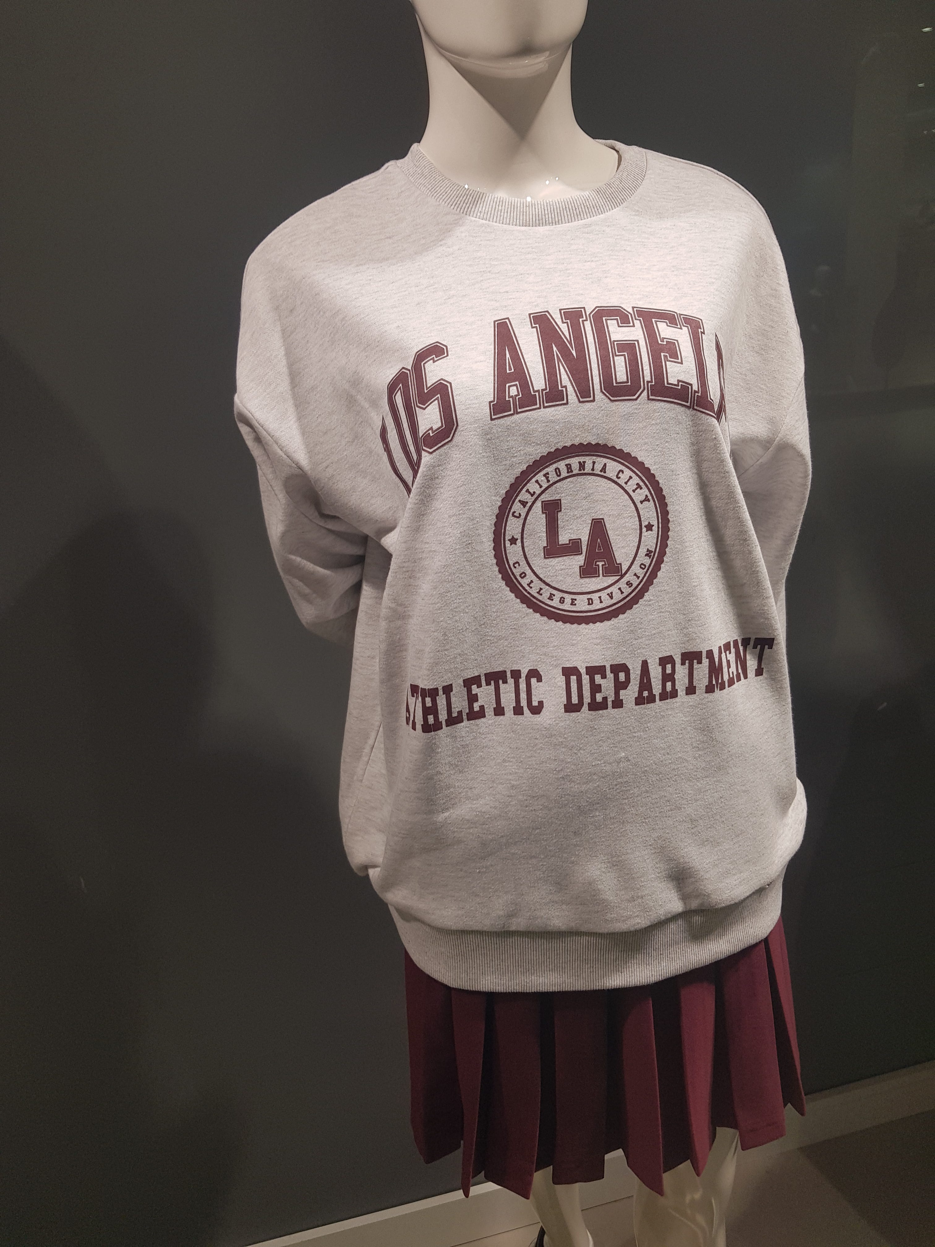
And finally we have the Los Angeles athletic department. All Americans are familiar with outwear associated with some university or other’s athletic department. Those abound on college campuses and beyond. But the athletic department of an entire city? Especially one the size of Los Angeles?
One can simply be amused at an item such as this. But another acquaintance of ours was spotted sporting a sweatshirt advertising Los Angeles and the year 1992. This was probably an arbitrary connection in the mind of the sweatshirt’s designer of a date with a well-known place and is modeled at least partly after American outwear celebrating some sports team’s major championship victory in a particular year. But anyone familiar with recent American history will be aware of what a tragic year 1992 was for the city of Los Angeles due to the riots that broke out in the wake of the Rodney King trials, paralyzing and destroying parts of the city and resulting in loss of 63 lives and thousands of injuries. No one who viewed the news coverage of white truck driver Reginald Denny being dragged from his vehicle at an intersection and brutally beaten by a violent crowd of blacks will be likely to find such an item as anything other than, at best, insensitive. So these designs range from the laughable, to the odd, to the potentially ominous and offensive.
I will just make mention of a final t-shirt design I saw here. I didn’t manage to photograph it but I did find a shot of it on the internet. This time the message was in perfectly comprehensible English and was even a sort of clever play on an English-language meme. It read “from Russia with hate,” obviously evoking the famous James Bond movie.
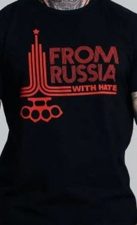
It also clearly alludes to the Olympic games, specifically the 1980 Olympics held in Moscow. Those close to my age will recall that it was in that year that the U.S. and other western countries boycotted the games due to the Soviet Union’s invasion of Afghanistan in the previous year. In place of the 5 rings symbolizing the 5 continents, in this rendition we see a set of 4 rings comprising a set of brass knuckles. I seriously doubt this design dates to anywhere near the era in which those games were held. Rather, it almost certainly traces to a much more recent origin, almost certainly to the years in which the West began to take an increasingly adversarial and antagonistic stance toward Russia beginning after the first decade of the 21st century.
So, though I find the attitude toward the West here generally more accepting than is true of stances in the U.S. toward Russia, there are those here who are not so well disposed toward it. I should mention that the fellow I saw wearing this shirt is what we call in the U.S. bi-racial: his mother is Russian but his father, who has Finnish citizenship, is either black or is from some other dark-skinned race—likely a recent immigrant from Africa, the Middle East, or perhaps India. So this fellow is noticeably dark complected as well. I make this observation because many western readers might be minded to associate the sympathies conveyed by this t-shirt with some sort of white supremacy movement or other.
We are due to return stateside very shortly. For now we’re enjoying some cool but sunny and quite pleasant fall weather.